Dark Theme feedback

When using dark mode theme, a few design elements seem to be slightly off. Pretty minor stuff like no drop shadows on cards. It would also be cool if the site’s logo could invert upon going into dark theme, the dark text gets hard to see in dark theme:
image

Is it suggested to stay in default theme for now?

1 Like

Yep, default theme is recommended for now. Inverting forum elements is coming soon!

1 Like

I was hoping the dark theme could please be improved a bit in terms of legibility/contrast.

I love the Dark theme! But I find it almost harder on the eyes and to browse than the regular theme. I think it has to do with the fact that the background is fairly light grey and the text/font is not a very vibrant/bright white, as well as small/thin.

About half of the RPG forums I visited half a darker theme, often black background or brown colours etc, I think if you spend a lot of time reading forums (such as pretty long form one) having a nice Dark theme can be really help out with your eye fatigue and even circadian rhythm if you are reading in evening. Anyway, it is a luxury problem! But if it is easy to implement a change or fix, that would rad! Thank you.

2 Likes

Would love a dark theme!

Hello everybody!

Since the dark theme was getting some love across different topics, I gave it its own topic to be discussed. I’m also brutally tagging @Froggy since he expressed interest on the dark theme in his introduction.

Since me and @Kingroy23 are working on this in our free time and none of us is a UI/UX designer, we don’t exactly have a roadmap or an idea of how much time it will take, but, what I can say to you is:

  • Making dark theme by just changing the palette is pretty easy and can be done in the admin interfaces with a few clicks. Once I settle with the forum-looking theme I’ll do some experiments on the available palettes.
  • As you can see in the first post, the logo is not yet ready for the dark theme.
3 Likes

Was messing with inverting logo, I think it’ll go over well. Obviously this was using the raster version so it’s not as clean as the actual version will be but overall I think it’ll look nice.


Feel free to give me a shout if you need any graphic assistance - I can certainly invert the vector version if needed.

2 Likes

Hello everybody!

I’ve updated the dark theme a little bit, to bring it back to a more forum-y feel.

It’s still not perfect (the logo with the inverted colors is not ready), but it should be ready in a matter of days. Sadly, I won’t have much time to work on the forum this weekend, so theme development will slow down a little bit.

3 Likes

Looking really good!

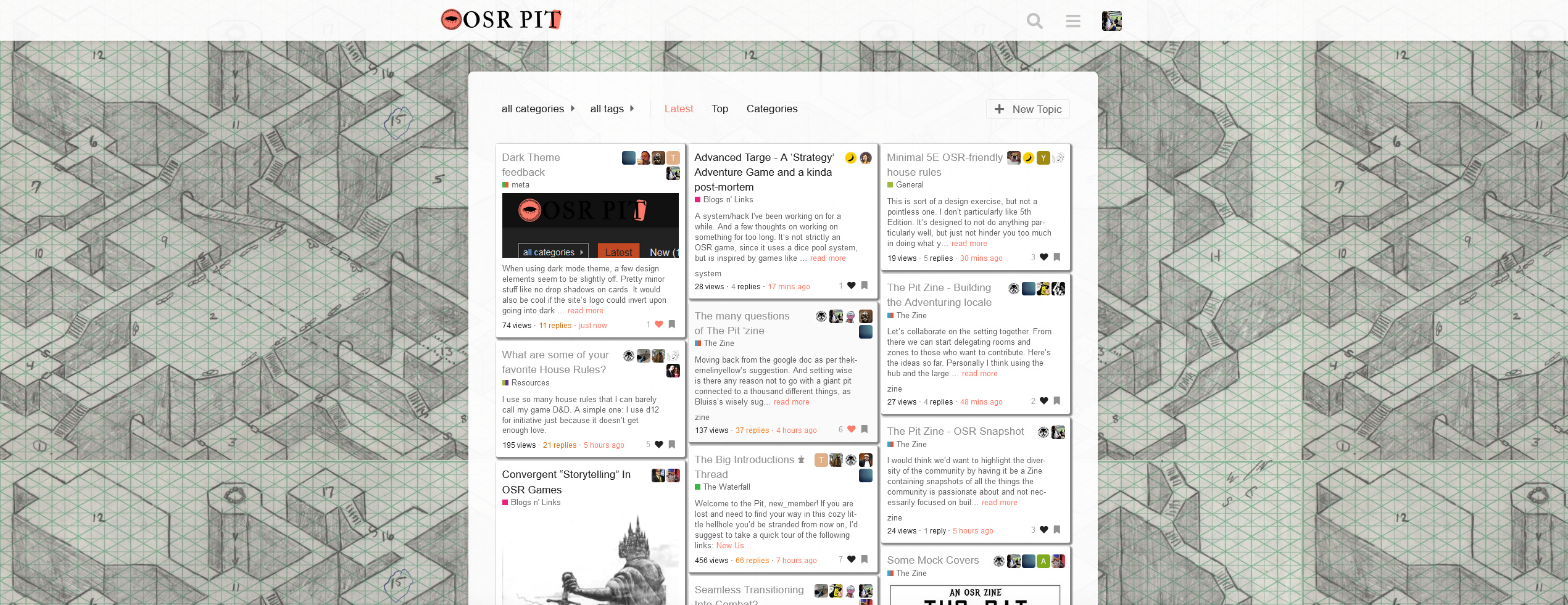
A problem I’m seeing is that it seems my idea of showing text previews for unread threads has been adopted; however, it’s showing for any threads with an unread post in them.

It really should only show the preview if you’ve never opened the thread.

Now, if you wanted to show text previews for opened threads that have new replies (which seems to be how the theme is operating as of now) it should be previewing the latest unread reply, not the original post that started the thread.

The reason it should operate this way is because if you’ve opened a thread before you’ve read the op, so you don’t need a preview of it any longer. A preview of the latest unread post may be helpful, because then you can determine if it’s worth opening to read at a glance - you get a little preview!

This seems to be the same for both the dark and light themes.

I’d also like to see image previews for unread posts as well, not just text previews, but I understand that’s a WiP.

I’ll try to work around it, but I fear that’s not going to be so easy, since we don’t have the last message in the homepage.

Here we go with the fourth attempt at this. I thought it worked last time…

3 Likes

Keep up the good work tkiy.

I think if you can’t show the last unread post simply setting the text previews for only unopened threads is the way to go. Just don’t worry about showing text previews for posts with unread replies.

Thanks so much! Really appreciate how you’ve taken feedback, it’s a real improvement.

Using Dark (or Light) theme on a high res monitory looks pretty bad. Lot of unused margin space:

To be fair, graceful doesn’t look great either:

I fear that’s a problem on Discourse’s side, since most of the themes don’t change the basic setup of the page. I’ll look into it this weekend, maybe there is some tweaking we can do on our side.

2 Likes

Just grave digging this post, so the Dark Mode thing never got fixed for me.

As you can see below
the Titles of every post become totally invisible in Dark mode while they work fine in the other modes. I love using dark mode, titles thing is the only problem I have with it, any chance this could please be fixed? :slight_smile:

Thx!

EDIT: I can’t seem to upload screenshots of the issue, the upload process just times out/keeps going forever…

1 Like

I’ll try to look into it, but my CSS skills only got worse during these past years, so I can make no promises.

@Kingroy23 I fear we need to update the docker image in order to be able to update the plugins, because we’re running on some old stuff here.

1 Like

Yup I’ve noticed this same thing with the titles being invisible unless hovered over.