Review for Primeval
by PM Schramm  <-Click or Scan for a Video Overview of this Module
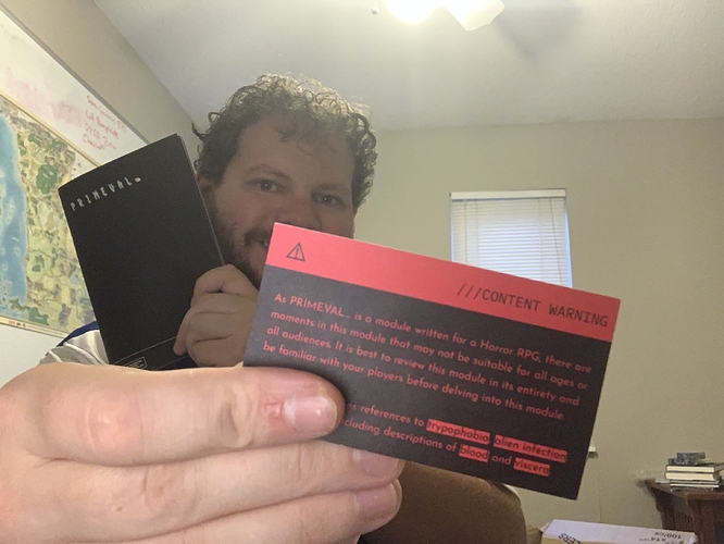
The Lone Archivist’s flagship, Primeval, promises on its included business card moments not suitable for all ages or all audiences, trypophobia, alien infection, body horror, and inclusions of blood and viscera. Sounds like a good time for a Mothership module! This is all delivered in a quality package, beautifully printed with an eye towards incredibly detailed and topical layouts. Primeval is packed with content, has an incredibly talented layout artist, and uses its form to bring the reader into the world it creates. However, the writing is dense. Extremely so. Much of the content included should have been trimmed before going to publishing and, although it looks absolutely stunning, usability is hindered. Any attempt at running this module as written is going to be a chore to accomplish at the table.
Look, Feel, and Space Utilization
The Primeval zine is printed in an 5.5”x8.5” format and measures in at an impressive 56 pages including covers. The cover is plain, but stylish, and the rear has a short introductory passage on what a reader can expect to find within. The front interior cover has a table of contents, along with a section on how to use the module. The rear has an “Appendix N” of several inspiratory works and some credits. The interior spread unfortunately is not used very well, as it merely drops the reader about halfway through the adventure.
The layout and style of the booklet is gorgeous, but extremely busy. One could even go so far as to call it indecipherable, or unknowable - it’s very hard to penetrate, and the eye is drawn to various things on each page, making it hard to know what’s important. There are also various typefaces, fonts, layouts, and colors utilized throughout Primeval; it can’t be stated enough times how striking the zine is to look at. Some of the choices however do make it difficult to read in certain light settings.
While much attention was paid to making the booklet look good, there were improper bleed and trim settings used for the printing. This is easily apparent on pages where the text reaches the top of the page. The most egregious example of this is found on pages 14 and 15, which has the upper portion of the text cut off. In addition, sometimes form takes the place of function to the zine’s detriment, such as in the “Personnel” section, where the artwork is very hard to decipher and the table with the people on it is hard to read at a glance and is mislabeled as both 2d10 and 1d20.
Content
Primeval begins with a much needed “How to Use” section. It lays out the guidelines that “Underlined Text” is important information or a game mechanic, “Highlighted Text” is for items, NPCs, and creatures - something with stats the crew can interact with, “Yellow Text” is for editorial details or secret/hidden details, “Oblique Text” is for narrative text or quotes, and “Boxed Text” is expository or informational text including editorial notes. This is all well and good, but then the zine goes on to immediately ignore these rules it set.
“Highlighted Text” is supposed to be used for items, NPCs, and creatures, but on the very next page Takahashi Advanced Genetics and Ur are both highlighted. T.A.G. is a group, not an NPC, and Ur is the name of the planet you’re going to. These inconsistencies in how the formatting is supposed to work are only consistent in that they’re repeated throughout the prose. Sometimes things are highlighted, sometimes not, and sometimes they’re underlined, like on page six where we see Ur is underlined instead of highlighted like it was previously.
There are a few errors such as the usage of the wrong forms of “its” and “hole”, a few repeated words, improper phrasing of narrative text, mislabeled tables, and the referencing of tables that don’t exist as well.
Usability
The biggest issue with Primeval is its usability. The reader is assaulted with fonts and colors and highlighting and somehow the zine is simultaneously over-explained yet hard to decipher. A great example is on page 18 - the administrative offices. The text is all over the place, there’s pictures and colors, its very hard to decipher what the referee is supposed to focus on. Compounding this issue is the fact that finding what you need requires a lot of flipping around, and with how dense the formatting and writing is, running the module without memorizing it seems to be nearly impossible.
Usually OSR modules have some faith in the ability of the referee to infer what they need to know or ad-lib something on the spot. Primeval takes the opposite approach, placing no trust in the referee to improvise things.
Conclusion
There is so much unneeded in this booklet. Much could have been trimmed. The most glaring example would be all of the yellow text, the majority of which is insights into what the author was thinking about when they wrote the module and where their inspiration came from. This alone would be a welcome tweak, but there is much more that could have been done as well to help increase the usability of Lone Archivist’s magnum opus. Primeval is the perfect example of what happens when a creative force is left unchecked - it drastically needed an editor.
There may very well be a great adventure within these 56 lovely pages. But, if there is, this reviewer can’t find it.
![]()
Link to Module

